OEM/ODM MANUFACTURING FOR GLOBAL BRANDS
- View Our Alibaba Store
- info@huhumahjong.com
- +86 13326907761
Mahjong Tile Color Guide for Wholesale Buyers
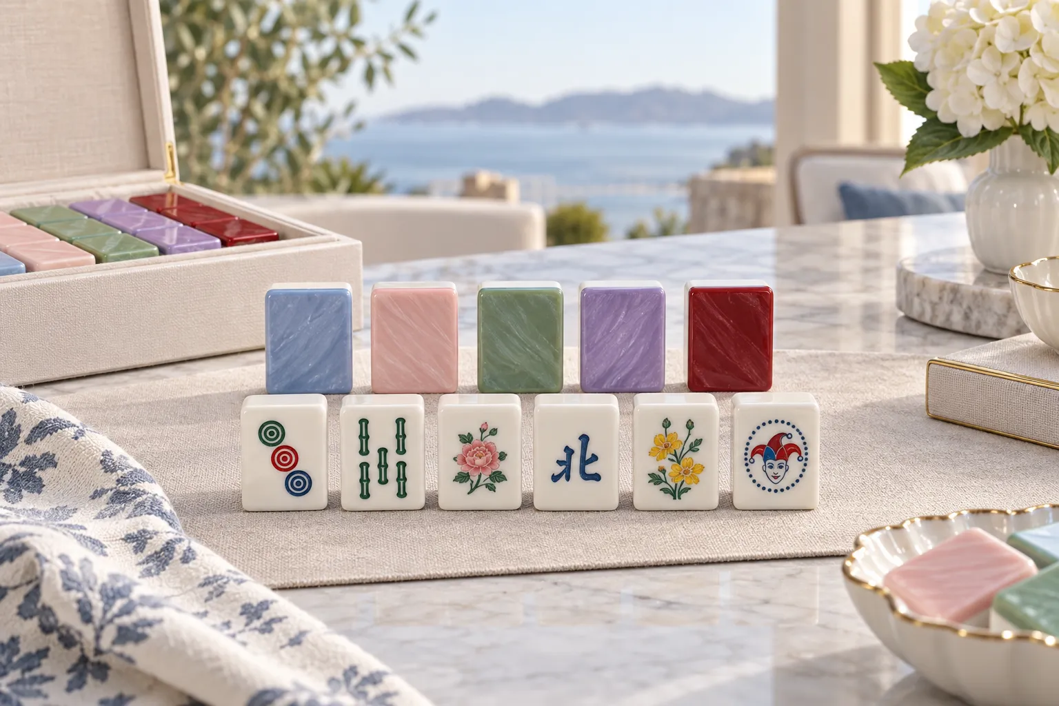
For retailers, distributors and private-label brands, choosing the right mahjong tile color is an important part of product development.
Colour affects more than appearance. It can influence readability, brand identity, photography, accessory matching, packaging and the overall retail positioning of a Mahjong set.
This guide explains what wholesale buyers should consider when selecting mahjong tile color for standard and custom orders.
Why Mahjong Tile Color Matters
The right mahjong tile color can help a product:
- Stand out in a retail collection
- Match a brand identity
- Improve tile readability
- Coordinate with racks and mats
- Create seasonal collections
- Support premium positioning
For private-label products, colour should be confirmed early because it may affect materials, samples, MOQ and production cost.
1. Start With the Target Customer
Before selecting a mahjong tile color, think about who will buy the finished product.
Different customers may prefer:
- Classic colours
- Soft pastels
- Bright statement colours
- Neutral tones
- Seasonal palettes
- Transparent or marbled effects
American Mahjong customers, for example, may be especially open to colourful and decorative designs.
2. Separate Tile Face Colour From Tile Back Colour
The front and back do not need to use the same colour.
A common combination may use:
- White or cream tile face
- Coloured tile back
This keeps the artwork easy to read while allowing the mahjong tile color on the back to create a stronger visual identity.
3. White and Cream Tile Faces
White and cream are popular because they provide a clean background for artwork.
They work well with:
- Red
- Green
- Blue
- Black
- Pink
symbols.
A neutral tile face can also make custom artwork easier to recognise.
4. Consider Blue Tile Backs
Blue is a versatile mahjong tile color for both traditional and modern sets.
It can work with:
- Blue-and-white packaging
- Clear racks
- Wooden racks
- Navy mats
Light blue can feel fresh and relaxed, while navy can create a more premium appearance.
5. Consider Green Tile Backs
Green works well for classic and lifestyle-focused products.
Possible shades include:
- Sage
- Forest green
- Emerald
- Jade
Green can pair nicely with wood accessories and cream tile faces.
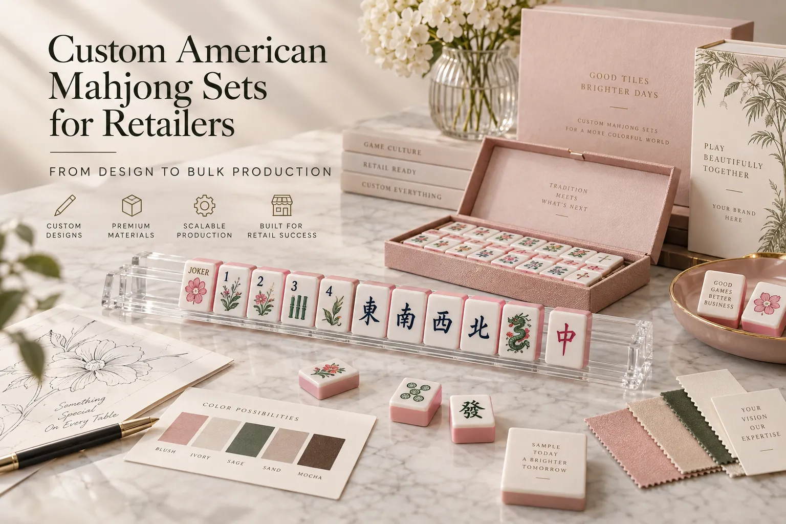
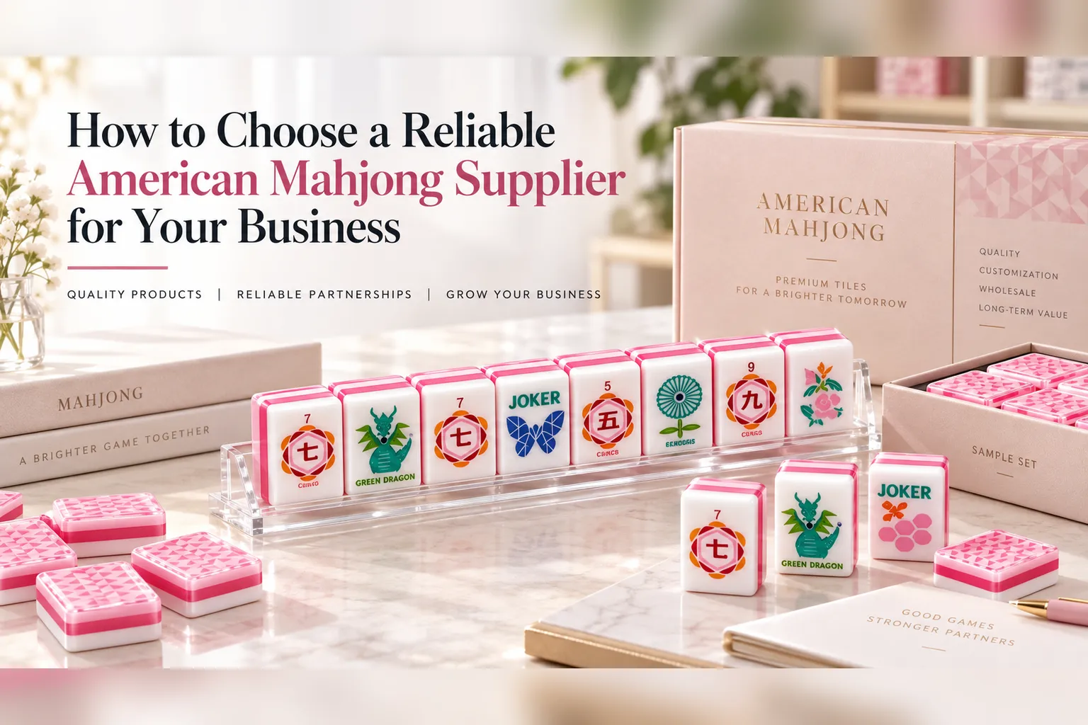
6. Consider Pink Tile Backs
Pink has become a popular colour for more decorative American Mahjong products.
Possible directions include:
- Soft blush
- Bright pink
- Rose
- Transparent pink
- Marbled pink
A pink mahjong tile color can work especially well with floral artwork and gift-focused collections.
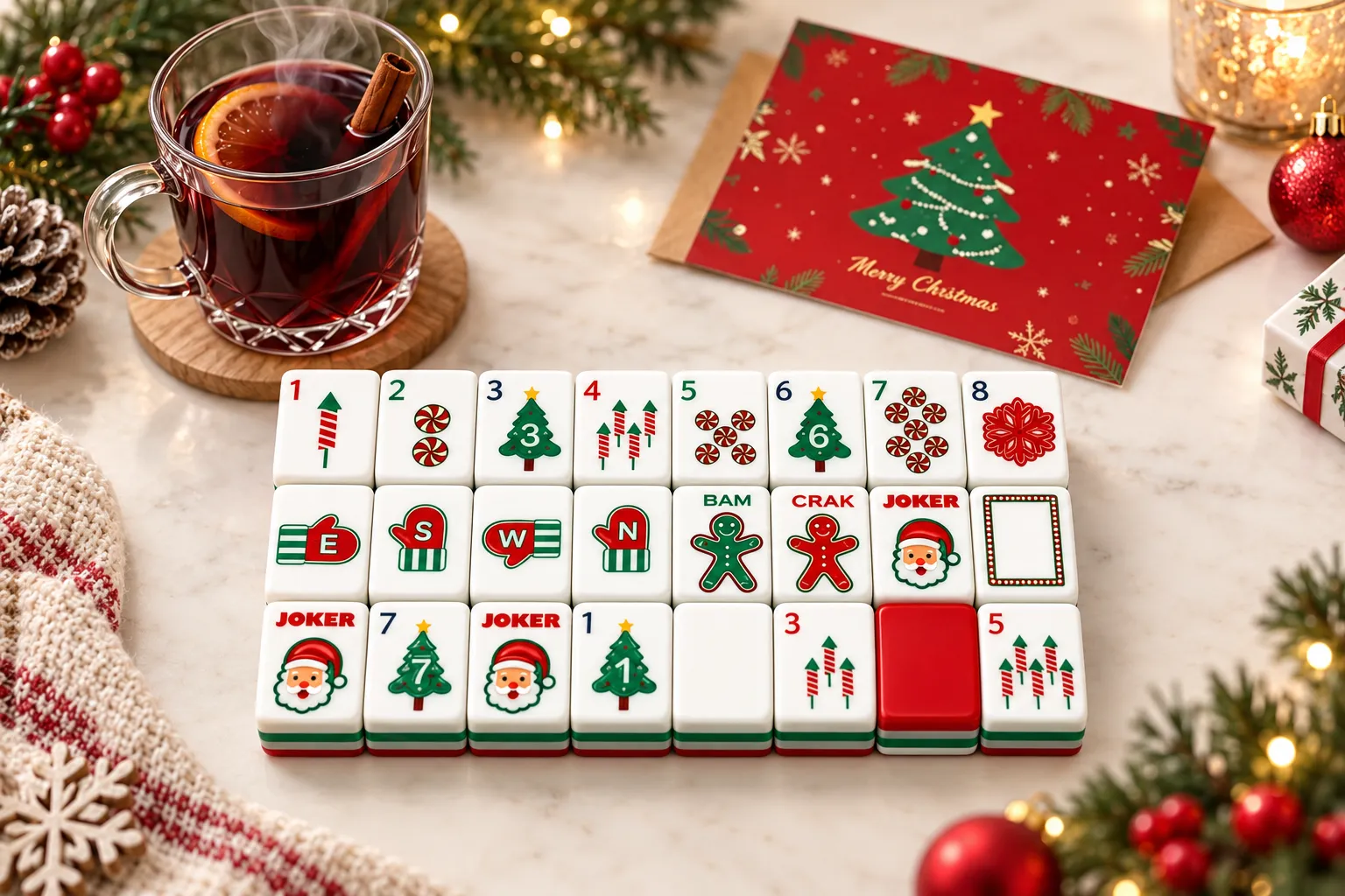
7. Consider Red Tile Backs
Red can create a stronger, more traditional or festive look.
It may work well for:
- Holiday collections
- Gift products
- Chinese-inspired designs
- Premium packaging
Deep ruby red can feel very different from a bright red, so shade selection matters.
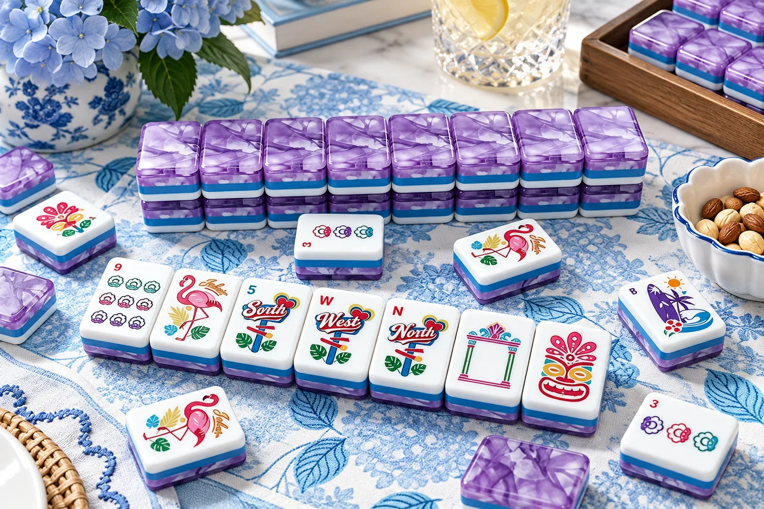
8. Consider Purple Tile Backs
Purple can create a distinctive premium look.
Possible styles include:
- Lavender
- Amethyst
- Marbled purple
- Transparent purple
For lifestyle collections, purple can help differentiate the product from more common blue or green sets.
9. Use Neutral Colours for Versatility
Neutral mahjong tile color options may include:
- Ivory
- Beige
- Grey
- Black
- Soft white
Neutral products can be easier to coordinate with different mats and racks.
They may also appeal to customers who prefer a more understated style.
10. Consider Transparent Colours
Transparent or translucent backs can create a modern appearance.
Possible options include:
- Blue
- Green
- Pink
- Purple
- Clear
However, transparency should be checked carefully under different lighting conditions.
11. Consider Marbled Colours
Marbled effects can make the product feel more decorative.
Each tile may have slightly different pattern movement.
Before approving a marbled mahjong tile color, confirm how much variation is acceptable.
Some brands like natural variation, while others prefer a more consistent pattern.
12. Match Colour With the Material
The same colour can look different depending on the material.
For example:
- Acrylic may appear brighter or more translucent
- Melamine may create a more solid colour
- Resin may allow different decorative effects
Always approve the colour on the final material.
13. Match Colour With the Surface Finish
Glossy, matte and satin finishes can all change how the same mahjong tile color appears.
Glossy surfaces may make colours look:
- Deeper
- Brighter
- More reflective
Matte finishes may make colours look softer.
Colour and finish should therefore be approved together.
14. Use Pantone References for Custom Colours
If a specific brand colour is required, provide a clear reference.
Pantone codes can help communicate the target colour.
However, Pantone alone may not guarantee an exact result because the material and finish can affect appearance.
A physical sample should still be approved.
15. Do Not Rely Only on Screen Colours
Colours on a phone or computer screen can vary.
Brightness, monitor settings and photography can all change how the mahjong tile color appears.
For custom orders, a physical colour sample is much more reliable than a screenshot.
16. Check Colour Under Different Lighting
Review the sample under:
- Natural daylight
- Warm indoor lighting
- Cool white lighting
A colour may look slightly different in each environment.
This is particularly important for transparent or marbled tiles.
17. Consider Readability
Colour should not make the tile face harder to read.
Check whether:
- Numbers remain clear
- Winds are easy to identify
- Jokers stand out
- Flowers remain distinct
The most attractive mahjong tile color is not useful if it reduces gameplay clarity.
18. Check Contrast Between Face and Artwork
Strong contrast can improve readability.
For example:
- Dark blue on white
- Red on cream
- Green on white
Very pale artwork on a pale tile face may be harder to recognise.
19. Coordinate With Racks
The mahjong tile color should work with the rack design.
Possible combinations include:
- Pink backs + clear rack
- Blue backs + wooden rack
- Green backs + cream rack
- Purple backs + transparent rack
The colours do not need to match exactly.
Complementary colours can also work well.
20. Coordinate With Mahjong Mats
The mat covers a large area of the table, so it can strongly affect how the tiles look.
A dark mat may make light-coloured tiles stand out.
A pale mat may work better with darker tile backs.
Wholesale buyers developing complete bundles should test the full colour combination together.
21. Coordinate With Packaging
For private-label products, repeating the mahjong tile color in the packaging can create a more complete visual identity.
Possible areas include:
- Box artwork
- Carry case
- Fabric lining
- Printed inserts
- Labels
This can help the product look more intentional.
22. Think About Seasonal Collections
Colour can be used to create seasonal product ranges.
For example:
Spring
Pink, green, floral tones
Summer
Blue, aqua, bright white
Autumn
Forest green, burgundy, warm neutral
Holiday
Red, green, gold
Seasonal mahjong tile color options can help retailers create limited collections.
23. Avoid Too Many Colours in One Product
A colourful Mahjong set can still feel organised.
Try to keep a clear hierarchy between:
- Tile face
- Tile back
- Artwork
- Racks
- Packaging
Too many unrelated colours can make the product feel visually inconsistent.
24. Consider Retail Photography
Some colours photograph more easily than others.
Dark glossy backs may reflect lights.
Transparent backs may need careful lighting.
Very pale colours may blend into white backgrounds.
If ecommerce photography is important, test the mahjong tile color in a simple photo setup before approving it.
25. Consider Social Media Content
Bright or distinctive colours may perform well visually in:
- TikTok
- Short product videos
However, colour should still fit the brand rather than being selected only for social media.
26. Confirm Colour Consistency in the Sample
Compare multiple tiles from the same sample set.
Check:
- Shade
- Saturation
- Transparency
- Marbling
- Gloss
A custom mahjong tile color should be reasonably consistent across the set.
27. Check Layered Tiles Carefully
If the tile uses multiple coloured layers, inspect the side view.
Check:
- Layer thickness
- Alignment
- Colour consistency
- Bonding
Layered construction can become a major visual feature of the product.
28. Confirm MOQ for Custom Colours
Standard colours may have lower MOQ requirements.
Custom mahjong tile color options may require:
- Higher MOQ
- Colour matching
- Special production
- Additional sample development
Always confirm MOQ before completing artwork.
29. Understand Colour Matching Costs
Custom colour development is usually a paid part of production.
Possible costs include:
- Colour matching
- Material preparation
- Sample development
- Special production setup
The quotation should clearly state whether custom colour is included.
30. Request a Physical Colour Sample
Before mass production, approve a physical sample.
Check:
- Colour
- Material
- Finish
- Transparency
- Tile back
- Artwork contrast
A digital rendering should not be the final colour reference.
31. Keep the Approved Sample
Once the mahjong tile color is approved, keep the physical sample.
This can be used to compare:
- Mass production
- Future reorders
- Replacement tiles
It provides a much clearer benchmark than a photograph.
32. Consider Batch Variation
Small colour differences can occur between production batches.
For products that require very close colour consistency, discuss this with the supplier before reordering.
Keeping an approved reference sample can help.
Mahjong Tile Color Wholesale Checklist
Before confirming production, check:
- Tile face colour
- Tile back colour
- Material
- Finish
- Pantone reference
- Transparency
- Marbling
- Artwork contrast
- Rack colour
- Mat colour
- Packaging colour
- MOQ
- Sample approval
Working With HUHU Mahjong
HUHU Mahjong works with retailers, distributors and private-label brands developing Mahjong products for international markets.
Buyers can discuss:
- Standard colours
- Custom colours
- Transparent tile backs
- Marbled tile backs
- Custom artwork
- Racks
- Mahjong mats
- Private-label packaging
- Samples
MOQ and customisation costs depend on the final design and production requirements.
Final Thoughts
Choosing the right mahjong tile color requires a balance between branding, readability and practical production.
Wholesale buyers should consider:
- Target customer
- Material
- Finish
- Artwork
- Accessories
- Packaging
- MOQ
For custom products, always review a physical colour sample before mass production.
A carefully selected mahjong tile color can help make a Mahjong product more recognisable, more attractive and better suited to its target retail market.
About the Author
HUHU Team
We share industry insights, product knowledge, and manufacturing updates to help global clients better understand mahjong production and OEM solutions.